Band 5.0 Sample: The graph below shows the proportion of the population aged 65 and over between 1940 and 2040 in three different countries.
Introductory Statement:
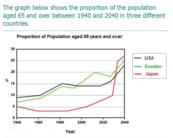
The representative graph provides the information about the percentage of people aged 65 and above in three separate regions, which are Japan, Sweden and USA from 1940 to 2040.
Overall Statement:
A glance is enough to make it clear that United States of America had highest proportions of old aged people. While, Japan consisted least percentage of people aged 65 and over. Also, the proportions of all aged people for all three countries got face after 2020.
Body Paragraph 1:
Coming to details, In 1940, Japan had only 5% of people aged 65 and above. After then, there was decrement in proportions for upcoming 30-40 years. The percentage got face in numbers after 2000 and then onwards, there was steady increment in population of old age people. And, the percentage was reached above 25% in 2040.
Body Paragraph 2:
As far as Sweden and United States of America were concerned. In 1940, both the regions had less than 10% of old aged people. And, both regions had constant increment in population till the end years of 20th century. But, after 2000, Sweden gains face in population and reached upto the peak of 25% in 2040. On the other hand, for America the levels of proportion remained contain from 1980 to 2020 and it achieves the level of 20% in 2040.
Band 5.0 Sample: The graph below shows the proportion of the population aged 65 and over between 1940 and 2040 in three different countries.