Band 7 Sample: The graph below gives the information about the percentage of the population
Tag: IELTS Writing Task 1 tips
IELTS Writing Task 1 tips
Writing Module is very important for the ielts preparation. Many students find it difficult to score good in writing task. They find difficulty in forming correct sentence structure. They find it difficult to interpret the data and keep sentence structure correct.
So in this article, all the tips and tricks are given for the better performance of the students. They can learn everything about the task 1 and can improve their band scores. Proper explanation of the paraphrasing and proper format of the overall statement is given. All the possible solved sample papers are of the task 1.
IELTS Writing Task 1 tips.
Band 6.5 Sample: The pie chart below shows the main reasons why agricultural land becomes less productive. The table shows how these causes affected three regions of the world during the 1990s.
Band 6.5 Sample: The pie chart below shows the main reasons why agricultural land becomes
Band 6.0 Sample: The graph below shows the consumption of fish and some different kinds of meat in a European country between 1979 and 2004.
Band 6.0 Sample: The graph below shows the consumption of fish and some different kinds
Band 6.5 Sample: The chart shows the number of shops that closed and the number of new shops opening in a country from 2011 to 2018.
Band 6.5 Sample: The chart shows the number of shops that closed and
Band 6.5 Sample: The charts below give information about USA marriage and divorce rates between 1970 and 2000, and the marital status of adult Americans in two of the years.
Band 6.5 Sample: The charts below give information about USA marriage and divorce rates between
Band 6.5 Sample:The charts below give information about travel to and from the UK, and about the most popular countries for UK residents to visit.
Band 6.5 Sample:The charts below give information about travel to and from the UK, and
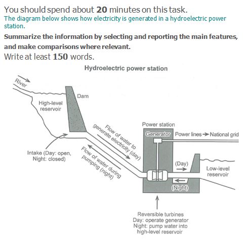
Band 6.5 Sample: The diagram below shows how electricity is generated in a hydroelectric power station.
Band 6.5 Sample: The diagram below shows how electricity is generated in a hydroelectric power
Band 6.5 Sample: The charts below show what UK graduate and postgraduate students who did not go into full-time work did after leaving college in 2008.
Band 6.5 Sample: The charts below show what UK graduate and postgraduate students who did
Band 6.5 Sample: The pie charts below show units of electricity production by fuel source in Australia and France in 1980 and 2000.
Band 6.5 Sample: The pie charts below show units of electricity production by fuel source
Band 6.5 Sample: The table below gives information about changes in modes of travel in England between 1985 and 2000.
Band 6.5 Sample: The table below gives information about changes in modes of travel in