Band 5.5 Sample: The graph below shows the demand for electricity in England during typical
Tag: IELTS Writing Task 1 Pie Chart
IELTS Writing Task 1 Pie Chart.
Writing Module is the most important of all the modules. Many students find it difficult to score good band scores in the Writing task. Writing task consist of task 1 and task 2. The duration of the task 1 is 20 minutes. It consist of pie charts, line graphs, bar graphs, maps and processes.
Here in this article, pie charts of the task 1 are discussed with paraphrasing and overall statement. Usually, 2, 3 or 4 pie charts are given. And they often interpret the same data. Students often get confused in the division of the content in BP 1 and BP 2.
IELTS Writing Task 1 Pie Chart.
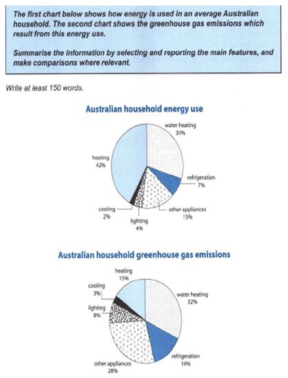
Band 5.5 Sample: The first chart below shows how energy is used in an average Australian household. The second chart shows the greenhouse gas emissions which result from this energy use.
Band 5.5 Sample: The first chart below shows how energy is used in an average
Band 5.0 Sample: The charts below show the number of Japanese tourists travelling abroad between 1985 and 1995 and Australia’s share of the Japanese tourist market.
Band 5.0 Sample: The charts below show the number of Japanese tourists travelling abroad between
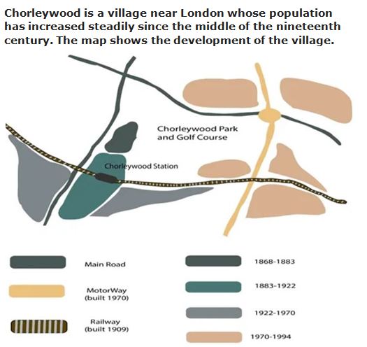
Band 5.0 Sample: Chorleywood is a village near London whose population has increased steadily since the middle of the nineteenth century.
Band 5.0 Sample: Chorleywood is a village near London whose population has increased steadily since
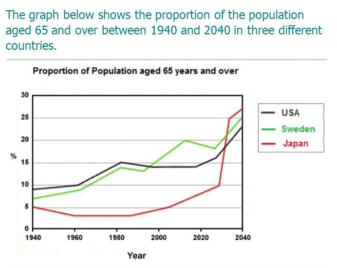
Band 5.0 Sample: The graph below shows the proportion of the population aged 65 and over between 1940 and 2040 in three different countries.
Band 5.0 Sample: The graph below shows the proportion of the population aged 65 and
Band 7 Sample: The three pie charts below show the changes …
Band 7 Sample: The three pie charts below show the changes in annual spending by
Band Sample 5.0: The charts below show the percentage of food budget the average family…
Band Sample5.0 : The charts below show the percentage of food budget the average family
Band Sample 6: The pie charts below show units of electricity…
Band Sample 6: The pie charts below show units of electricity production by fuel source
Band 5.0: The charts below give information on the ages…
Band 5.0: The charts below give information on the ages of the populations of Yemen and Italy
Band 4.5 Sample: The charts below show the results…
Band 4.5 Sample: The charts below show the results…of a survey of adult education. The