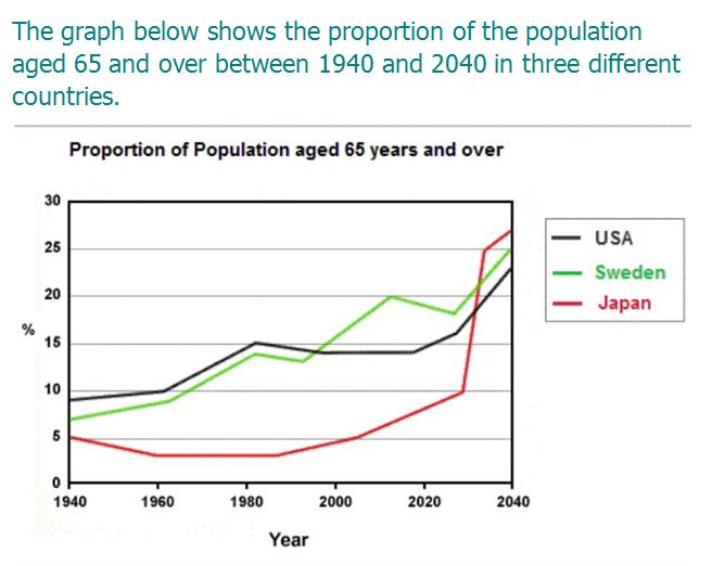
Band 5.0 Sample: The graph below shows the proportion of the population aged 65 and
Band 5.0 Sample: The graph below shows the proportion of the population aged 65 and over between 1940 and 2040 in three different countries.
IELTS Writing Task 1 Line Graph.
Writing task 1 is consist of data interpretation. It is of various types, Bar graphs, Line graphs, Multiple Graphs, Pie charts and Table.
In line graph, various lines are given, representing the different data. The lines can be straight or curved. Students have to understand it and write a report on it. It is very useful for the beginners as well as other students. Students can get idea about the task.
Here, in the article, students can get idea of paraphrasing the statement and overall statement. Moreover, students can get idea about the division of data which is to be written in BP1 and BP2.
IELTS Writing Task 1 Line Graph.
Band 5.0 Sample: The graph below shows the proportion of the population aged 65 and
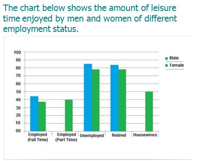
Band 4.5 Sample: The chart below shows the amount of leisure time enjoyed by men
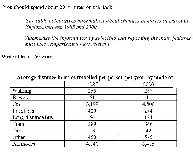
Band 7 Sample: The table below gives information about changes in modes of travel in
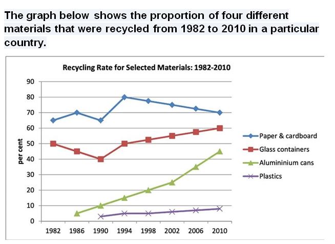
Band 5.0 Sample: The graph below shows the proportion of four different materials that were
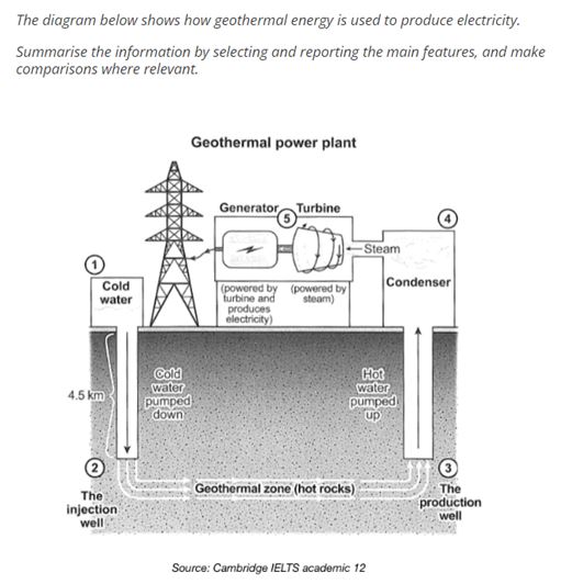
Band 7.5 Sample: The diagram below shows geothermal energy is used to produce electricity. The

Band Sample 7.0: The bar chart below shows the average Australian water consumption in selected

Band Sample 5.5: The chart below shows the different levels of post-school qualifications in Australia
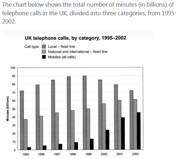
Band Sample 6.0:The chart below shows the total number of minutes (in billions) of telephone

Band Sample 5.5: The table below gives information about changes in modes of travel in

Band Sample 6.0: The graph below shows the number of tourists visiting a particular Caribbean
You cannot copy content of this page